Measuring content performance isn't just about tracking what’s easy; it’s about tracking what matters. The whole point is to tie every piece of content you create back to a specific business goal. From there, you can pick the key performance indicators (KPIs) that actually show you whether you're making progress.
This means looking past simple views and likes to dig into the metrics that really move the needle—things like engagement rates, lead generation, and, ultimately, revenue. It's how you connect the dots between your content efforts and tangible business outcomes.
Moving Beyond Views to Measure Real Impact
It’s easy to get caught up in chasing high view counts. It feels productive, right? But more often than not, it's a vanity game that does very little for business growth.
Think about it: a video could rack up thousands of views but generate zero leads. Meanwhile, a super-niche blog post with only a hundred readers might bring in two high-value customers. The real question isn't "How many people saw this?" It's "Did this content do the job I created it for?" A HubSpot report found that only 33% of marketers believe their content marketing is effective, often because they are tracking the wrong metrics.
Answering that question requires a total shift in how you approach content. Instead of creating something and then scrambling to find metrics that make it look good, you need to start with a clear, measurable objective before you even begin. Every single piece of content, whether it’s a 30-second TikTok or an in-depth case study, needs to have a specific purpose.
So, what does success actually look like for you?
- Growing an audience? You'll want to obsess over follower growth, reach, and watch time.
- Generating qualified leads? Your priorities should be form submissions, newsletter sign-ups, and demo requests.
- Driving sales? Keep a close eye on click-through rates on product links, conversion rates, and attributed revenue.
This simple process flow breaks down how to connect your goals to real, meaningful measurement.
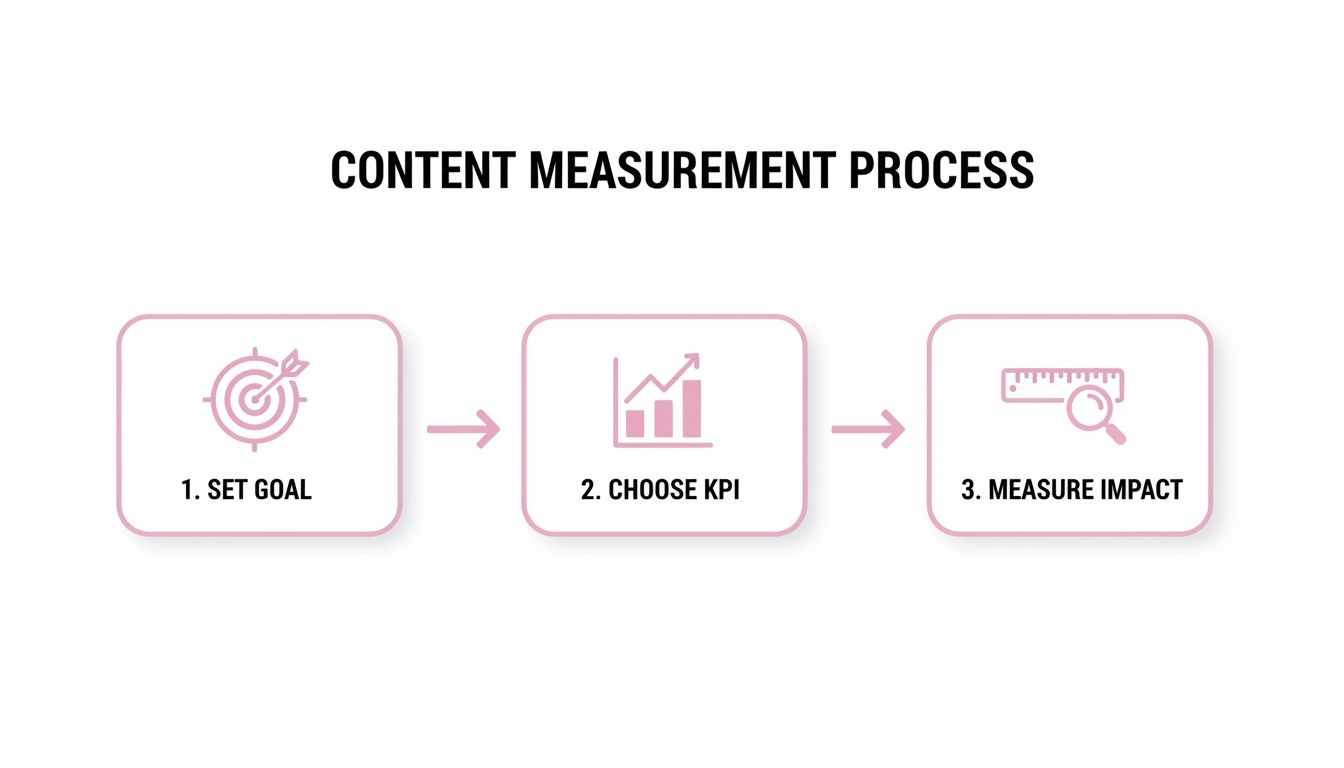
As you can see, effective measurement isn't some complex mystery. It’s a straightforward discipline: set a goal, pick a relevant KPI, and then measure the impact.
Aligning Goals With Metrics
Once you’ve locked in a goal, choosing the right KPIs becomes almost second nature. If your main objective is brand awareness, metrics like impressions and social shares are gold. But if your goal is to generate leads, those same metrics become secondary to things like the conversion rate on your landing page.
It’s not just a nice idea, either. The data backs it up—studies have shown that companies that set clear goals are 376% more likely to report success.
The most effective content strategies are built on a foundation of clear objectives. Without a defined goal, you're just creating noise. With one, every piece of content becomes a strategic asset working toward a measurable outcome.
To help you get started, here's a quick reference table for matching common content goals with the metrics that truly matter.
Matching Content Goals to Key Performance Indicators
| Content Goal | Primary KPIs | Example Metric |
|---|---|---|
| Brand Awareness | Reach, Impressions, Social Shares, Watch Time | 10% increase in organic reach month-over-month |
| Audience Engagement | Likes, Comments, Saves, Average View Duration | Achieving a 5% average engagement rate on Instagram |
| Lead Generation | Form Submissions, Clicks to Gated Content, MQLs | 50 new webinar sign-ups from a promotional video |
| Website Traffic | Click-Through Rate (CTR), Unique Visitors, Bounce Rate | Driving 1,000 new visitors to a blog post from social media |
| Sales & Conversions | Conversion Rate, Revenue, Customer Acquisition Cost (CAC) | Generating $5,000 in sales attributed to a product video |
| Customer Loyalty | Repeat Visitors, Community Engagement, Customer Churn | Reducing customer support tickets by 15% with how-to videos |
This table is a great starting point, but remember to tailor your KPIs to the specific nuances of your campaigns and business objectives.
To truly understand the comprehensive value your content delivers, a deep dive into how to calculate content marketing ROI is indispensable. This helps connect top-of-funnel activities, like viral video clips, to bottom-line results. And for those curious about the mechanics of widespread attention, exploring what is considered viral can provide useful context for setting realistic awareness goals.
Choosing the Right Metrics for Your Content Goals
Not all metrics are created equal. In fact, focusing on the wrong ones can send your entire content strategy spiraling in the wrong direction. To really understand how your content is performing, you have to pick key performance indicators (KPIs) that connect directly to your actual business goals. Chasing views is a vanity game; it won't build a sustainable business.

This is where most content strategies fall flat—the disconnect between effort and results. We all feel the pressure to prove our work is paying off, but the data shows it's a huge challenge. While 83% of leaders say connecting content to revenue is a priority, only 36% of marketers feel they can actually track content ROI accurately. This gap, highlighted in recent marketing ROI stats from genesysgrowth.com, creates a massive opportunity for teams who can get this right.
The best way to avoid this trap is to organize your metrics into four key areas. Each one tells a different part of your content's story.
Metrics for Reach and Awareness
At the very top of the funnel, the goal is simple: get in front of as many relevant people as possible. Reach metrics tell you how big of an audience your content is actually touching.
Think of these as your first signal that you're even in the game:
- Impressions: The raw number of times your content was displayed on a screen.
- Unique Viewers: How many individual people laid eyes on your content.
- Follower Growth: A straightforward look at how quickly your audience is expanding.
Practical Example: A B2B tech company launches a short video series on LinkedIn. In the first month, they track impressions, which hit 50,000. This tells them their targeting and hashtag strategy is successfully placing their content in front of a large audience, achieving their initial awareness goal.
These numbers tell you if your content is discoverable and cutting through the noise. Any solid video content marketing strategy starts here, building an initial audience before asking them to do anything else.
Metrics for Engagement and Interest
Once you’ve grabbed their attention, you have to hold it. Engagement metrics show you if your content is genuinely interesting or just another piece of scroll-fodder. High engagement is almost always a sign of high-quality, resonant content.
Here's what to watch:
- Likes, Comments, and Shares: These are direct signals that your content sparked a reaction.
- Watch Time and Average View Duration: For video, this is gold. It shows exactly how long you kept someone hooked.
- Saves: This is a powerful one. A save means your content was so valuable someone wanted to come back to it later.
A high number of saves often indicates your content is educational or highly practical. This is a far better indicator of value than a simple 'like' because it signals an intent to revisit and reuse the information.
Metrics for Conversion and Action
This is where the rubber meets the road—where your content starts creating tangible business value. Conversion metrics track whether your audience is taking the specific action you want them to take, turning them from passive viewers into active leads or prospects.
Imagine a B2B SaaS company that repurposes a webinar into short video clips for LinkedIn. For them, lead form submissions are infinitely more valuable than a high view count on those clips.
Other key conversion metrics include:
- Click-Through Rate (CTR): What percentage of people who saw your content actually clicked the link?
- Sign-ups: The number of people who subscribed to a newsletter or registered for a webinar.
- Downloads: How many users downloaded that PDF guide, template, or other gated resource you offered.
Metrics for Revenue and Loyalty
Ultimately, the most important measure of content performance is its impact on the bottom line. Revenue metrics are what connect your content directly to sales and long-term customer value, giving you the undeniable ROI your leadership team wants to see.
These bottom-of-funnel metrics are the most powerful ones in your toolkit:
- Sales Attributed to Content: Using UTMs or CRM data to trace a purchase directly back to a specific piece of content.
- Customer Lifetime Value (CLV): Analyzing whether customers who engaged with your content end up being more valuable over the long haul.
- Conversion Rate: Of all the leads your content generated, what percentage became paying customers?
When you build your measurement plan around these four categories, you stop drowning in data and start focusing on the numbers that truly matter.
Setting Up Your Content Tracking Toolkit
If you're not collecting accurate data, you’re just guessing. Effective content measurement starts with a solid foundation, and without a reliable way to gather the right information, you're flying blind. This is where your tracking toolkit comes in—it’s the combination of tools and simple techniques that capture user interactions, turning raw clicks and views into a clear story about what’s actually working.
Think of it like this: each video or post is an experiment. Your tracking setup is how you measure the results. The goal is to connect the dots from a TikTok view to a website visit and, ultimately, to a new customer.
Mastering UTM Parameters for Clear Attribution
One of the simplest yet most powerful tools we have for this is the UTM parameter. These are just little snippets of text added to the end of a URL that tell analytics platforms, like Google Analytics, exactly where your traffic is coming from. They completely eliminate the guesswork.
Instead of seeing a vague lump of "Social" traffic, you can pinpoint the exact post that drove a visitor. Research by Terminus has found that consistent UTM tracking can improve lead attribution accuracy by over 25%. It's a small effort with a huge payoff.
Let's make this practical:
Say you’re promoting a new webinar with a short video you've posted on LinkedIn, Instagram, and in your email newsletter. You’d create unique UTM-tagged links for each one:
- LinkedIn Post:
yourwebsite.com/webinar?utm_source=linkedin&utm_medium=social&utm_campaign=q4-webinar - Instagram Bio:
yourwebsite.com/webinar?utm_source=instagram&utm_medium=social-bio&utm_campaign=q4-webinar - Email Newsletter:
yourwebsite.com/webinar?utm_source=newsletter&utm_medium=email&utm_campaign=q4-webinar
Now, when you log into Google Analytics, you can see precisely which channel drove the most sign-ups. No more wondering—you have the data to decide where to double down.
Leveraging Platform-Native Analytics
UTMs are fantastic for tracking traffic to your site, but don't ignore the goldmine of data inside each social media platform. These native analytics tools give you insights you simply can't get anywhere else.
- YouTube Studio: Go way beyond view counts. The real story is in Audience Retention. Is there a huge drop-off in the first 10 seconds? Your hook needs work. Does a specific segment have super high retention? That’s probably your next short-form video clip, right there.
- Instagram Insights: I always tell people to focus on Saves and Shares. A "like" is passive. A save or share means someone found your content so valuable they wanted to keep it or pass it on. That's a much stronger signal.
- TikTok Analytics: Pay close attention to your 'For You' page impressions. This number tells you how well the algorithm is picking up your content and showing it to fresh audiences.
The real magic happens when you combine these insights. Use the platform's analytics to figure out what content resonates there, then use your UTMs to measure how well that engagement drives your actual business goals.
Connecting Content to Sales with CRM Integration
The final piece of the puzzle is tying all this back to revenue. By connecting your content performance to your CRM, like HubSpot or Salesforce, you can finally close the loop and measure true ROI.
Integrating your CRM with your analytics lets you see which specific videos, blog posts, or social updates a lead engaged with before they became a paying customer. This is the holy grail of content measurement. To get this right, you need a smart way to organize all your tracking codes, which is where a good tag management system comes in; you can learn more about tag management systems and see how they fit into the bigger picture.
For many teams, the next logical step is to figure out how to automate social media posts. This frees up valuable time from the day-to-day grind, letting you focus on analyzing this deeper, more valuable data.
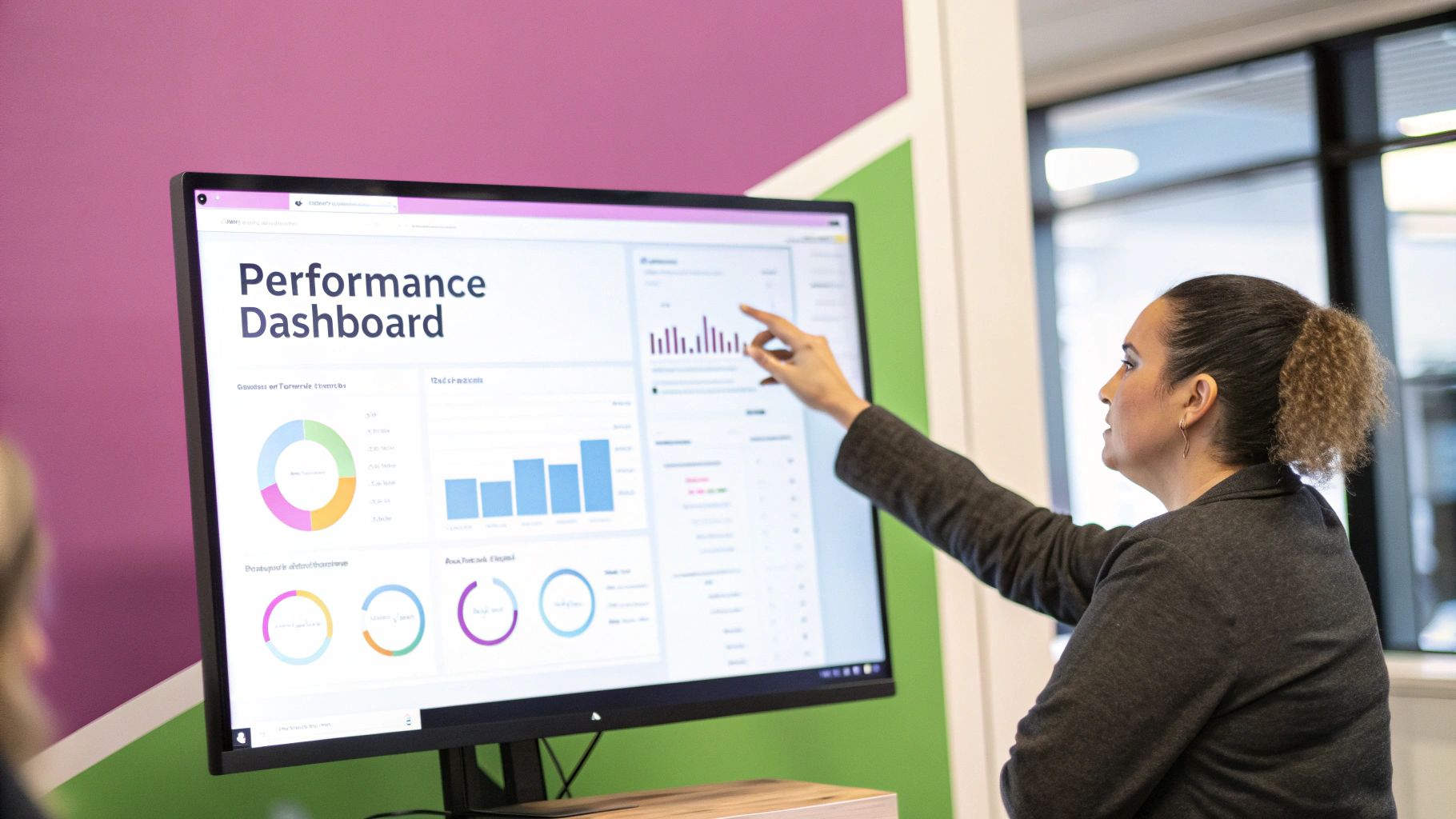
Building Dashboards to Visualize Performance
Raw data is a beast. Staring at a spreadsheet packed with numbers can feel like trying to read a different language. The story is in there, somewhere, but it’s nearly impossible to see. This is exactly why a good performance dashboard isn't just a nice-to-have; it's a total necessity.
![]()
A well-built dashboard is more than just a report. It's a live command center for your content strategy, helping you spot what's working (and what's not) almost instantly. No more jumping between five different tabs. You get one clear, unified view. In fact, companies that use data visualization tools are 28% more likely to find timely information than those stuck with traditional reporting.
Creating Your First Dashboard
You don’t need to drop a ton of money on fancy software to get started. Honestly, a free tool like Google Looker Studio is more than powerful enough for most teams. The beauty of it is the simplicity: you plug in your data sources, and then you can drag and drop to create visual "widgets" like charts, graphs, and tables.
Let's imagine a team that’s all-in on short-form video. They need their dashboard to answer a few critical questions at a glance:
- Which specific video clips are people actually watching all the way through?
- Which social platform is sending us the best traffic?
- Is our audience actually growing month over month?
To build this, they’d connect Google Analytics, YouTube Studio, and the native analytics from their social accounts. The dashboard's job is to pull the most important metrics from each source and display them in one clean, easy-to-scan interface.
Designing a Video Performance Dashboard
A great dashboard guides your eye from the big picture down to the details. For our video team, an effective layout would tell a story.
Here’s what that might look like:
- Top Performing Clips by Watch Time: At the very top, a simple bar chart showing the top five video clips from the last 30 days, ranked by total watch time. This tells you immediately what’s resonating and keeping people engaged.
- Conversion Rate by Platform: Next, a pie chart pulling in that UTM-tracked data from Google Analytics. It would instantly show whether LinkedIn, Instagram, or TikTok is driving the highest percentage of clicks or demo requests.
- Audience Growth Over Time: A classic line graph tracking follower or subscriber growth across all key channels. This is your 10,000-foot view of whether your content is expanding your reach.
The most effective dashboards focus on trends, not just static numbers. A good visualization doesn’t just show you that you got 100 conversions last month; it shows you whether that’s up or down from the month before, and helps you start asking why.
For agencies juggling multiple clients, this approach is a game-changer. It gives you a transparent and genuinely compelling way to show the value you’re providing. Instead of sending over a dense PDF report, you share a live link that proves your strategy is moving the needle, all backed by clear, undeniable data.
From Analytics to Action: Making Your Data Work for You
Let's be honest: measurement is useless if you don't do anything with the data. The real magic happens when you move beyond just reporting numbers and start using those insights to make your content better. Your dashboard isn't a trophy case; it's a playbook for your next move.
The whole process starts by asking a simple question: "What is this data actually telling me?"
You need to hunt for the patterns, the outliers, and the quiet success stories hiding in the charts. For example, you might look at your dashboard and notice that your short-form videos with animated captions have a 30% higher average watch time. That’s not just a cool stat—it’s your audience telling you exactly what they want to see more of. It's a direct instruction.
Forming a Hypothesis From Your Data
Once you start spotting these trends, the next step is to turn them into educated guesses, or what we call testable hypotheses. This is the heart of a data-driven content strategy, and it’s what separates the pros from the amateurs.
Here’s how it works in the real world:
- Observation: "Our videos that kick off with a question get way more comments than the ones that start with a statement."
- Hypothesis: "If we open our next three videos with a direct question, we can increase our average comments per video by 15%."
- Action: Create three new videos, each starting with a question-based hook.
- Measurement: After they're live, track the comments and see if the average beats your baseline.
This simple loop takes all the guesswork out of your content creation. You're no longer operating on gut feelings; you're making calculated decisions based on what your audience has already shown you they like.
A/B Testing Your Way to Winning Content
This kind of thinking leads perfectly into A/B testing. It's a straightforward way to figure out what works best by changing just one thing at a time. You can test anything: the hook, the thumbnail, the call-to-action (CTA), even the background music.
Imagine you're an e-commerce brand trying to sell a new pair of sneakers. You could test two versions of a product video:
- Version A: Uses a hard-sell "Shop Now" CTA with a link overlay popping up.
- Version B: Features more user-generated content and ends with a softer "See how others are styling them" CTA.
By running both and tracking the click-through rates and, more importantly, the sales, you get a definitive answer. It's not about which video you like more; it’s about which video actually moves the needle. The data doesn't lie.
Benchmarking Puts Your Performance in Context
Looking at your own data is one thing, but you also need to know how it stacks up against the competition. This is where industry benchmarks are incredibly helpful. They give your numbers the context they need to be truly meaningful.
For instance, recent industry-wide data shows the median engagement rate is a healthy 56.21%, meaning over half of viewers are actively engaging with content. You can dig into more content marketing benchmarks on Databox to see how your specific niche is performing.
If your own engagement rate is stuck at 30%, you know you've got some work to do. But if you’re hitting 60%, you’re crushing it and should feel confident doubling down on your current strategy.
When you combine this kind of internal analysis, structured testing, and external benchmarking, you create a powerful feedback loop. Every single data point becomes an insight that helps you sharpen your strategy, ensuring your content doesn’t just get views—it gets results.
Frequently Asked Questions About Content Performance
When you get serious about content analytics, a few questions always seem to pop up. Let's tackle some of the most common hurdles marketers, creators, and agencies face when trying to figure out what's actually working.
How Often Should I Report on Content Performance?
There's no magic number here—your reporting cadence really depends on the platforms you're on and the goals you're chasing. A balanced approach is usually best.
For fast-moving platforms like TikTok or Instagram Reels, you should be doing at least a weekly check-in. Things change so quickly there; if you wait a month, you've already missed the boat on a trend. Look at metrics like watch time and shares to get a quick pulse on what's resonating.
But for your bigger, long-term plays—like driving organic traffic from a blog or generating leads—a monthly or quarterly report makes more sense. This gives you a clearer, more stable picture of what's happening and stops you from overreacting to a random bad day. It helps you spot the real growth patterns.
The real key is consistency. Whatever you decide, stick to it. A regular reporting schedule turns measurement from a chore into a strategic habit that helps everyone make smarter decisions.
What Are the Biggest Mistakes to Avoid When Measuring Content?
I've seen a few common pitfalls trip up even the sharpest teams. If you can steer clear of these, you’ll be in a much better position to get accurate insights.
The absolute biggest mistake is getting obsessed with vanity metrics. A post with 10,000 likes is great for the ego, but if your goal was to generate leads and it brought in zero, it's a failure. Always tie your metrics back to a real business objective.
Another classic error is inconsistent tracking. If you're not using UTM parameters for every single campaign, you're creating a data mess that makes proper attribution impossible. It's a non-negotiable for clean data.
Finally, don't get stuck in "analysis paralysis." Piling up data is easy. The whole point is to find actionable insights that help you create better content next time. If your data isn't leading to a decision, it's just noise.
How Can I Measure ROI for Top-of-Funnel Content?
This is a tough one, because brand awareness content doesn't usually lead directly to a sale. You have to get a little creative and use what we call proxy metrics to show its value.
A great place to start is Google Search Console. Are you seeing an increase in branded search volume? That’s a strong sign that more people know who you are.
Also, keep an eye on direct website traffic in your analytics. When that number goes up, it often means people are remembering your name and typing your URL right into their browser. You can also track engagement rates on your content and even add a simple "How did you hear about us?" question to your sign-up forms. It might not be a direct dollar-for-dollar calculation, but together, these clues build a powerful case for your top-of-funnel efforts.
Ready to turn your long-form videos into a library of high-performing short clips automatically? Our AI finds the best moments, adds animated captions, and prepares your content for TikTok, Reels, and Shorts up to 10x faster. Start creating with a free trial today.