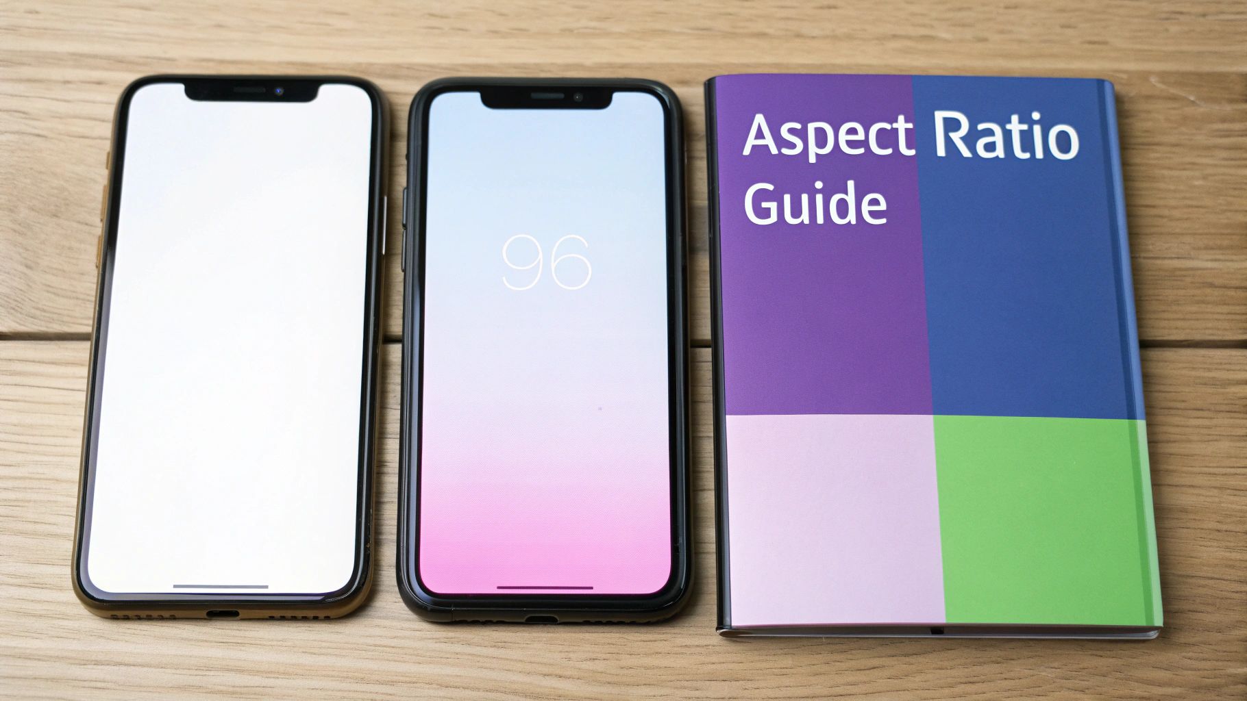
The absolute best TikTok aspect ratio is 9:16, and the ideal dimensions are 1080×1920 pixels. If you remember only one thing, let it be this. Nailing this vertical format is the single most important technical step you can take to make your content look like it belongs on the platform and grab a viewer's attention from the first frame.
Why the 9:16 Aspect Ratio Is Non-Negotiable

Think of the 9:16 ratio as the native language of TikTok. When your content is in this tall, vertical format, it speaks that language fluently. Your video fills the entire screen, creating a full-screen, immersive experience that pulls people right into what you’re showing them. Studies show that full-screen vertical videos can increase brand recall by as much as 2x compared to horizontal formats on mobile.
On the flip side, trying to upload a video in a different format—like a horizontal 16:9 or a square 1:1—just doesn't work. It’s like showing up to a party in the wrong dress code. The content instantly feels out of place. TikTok has to slap on those distracting black bars to fill the void, which basically screams to viewers, "This wasn't made for you."
How It Affects the Algorithm and Viewers
This isn't just about looks; it directly impacts how your video performs. The TikTok algorithm is built to push content that keeps people on the app. Videos that are formatted correctly create a smooth, uninterrupted viewing session, which usually means longer watch times and better engagement.
A poorly formatted video creates friction. That tiny moment of confusion or annoyance is often enough to make someone swipe away. That quick swipe sends a signal to the algorithm that your content isn't holding attention, and over time, that can seriously hurt your reach.
A Quick Example: Cooking Videos
Let's say a food creator is filming a new recipe tutorial.
- Scenario A (Wrong Ratio): They film it horizontally (16:9) for YouTube and just upload that same file to TikTok. The video shows up with chunky black bars above and below. Key details get shrunk down, on-screen text is hard to read, and viewers lose interest fast. Swipe.
- Scenario B (Right Ratio): They film a separate take vertically (9:16). The camera is tight on the action, filling the screen with chopping, mixing, and sizzling. The final dish looks amazing up close. People can actually follow the recipe, so they stick around, leading to more likes, comments, and shares.
The data backs this up completely. Videos shot in the vertical 9:16 format get a 40.1% increase in impressions on TikTok compared to square or horizontal ones. That number alone tells you everything you need to know about why this format has become an industry-wide priority.
It’s not just TikTok, either. This vertical-first mindset is the new normal for reaching people on their phones. You'll see the same principle at play across other platforms, as detailed in guides on Instagram Reel dimensions and the 9:16 aspect ratio.
TikTok Video Specifications at a Glance
Here’s a quick-reference table with the key technical specs you need to know. Think of this as your cheat sheet for uploading high-quality videos every time.
| Specification | Recommendation | Details |
|---|---|---|
| Aspect Ratio | 9:16 | The standard vertical phone screen format. Non-negotiable for an immersive feel. |
| Resolution | 1080×1920 pixels | Ensures your video looks crisp and professional. You can upload in 720p, but 1080p is better. |
| File Format | .MP4 or .MOV | These are the most common and universally supported formats. TikTok also supports .AVI and .GIF. |
| File Size | Up to 287.6 MB (iOS) / 72 MB (Android) | For ads, the limit is 500 MB. Keep files manageable for faster uploads. |
| Video Length | Up to 10 minutes | While you can go long, most viral content is still under 60 seconds. |
Getting these settings right from the start saves you a ton of headaches and gives your content the best possible chance to succeed.
A Guide to All Supported TikTok Aspect Ratios
Everyone knows that 9:16 is the king of TikTok, but it's not the only format the platform technically accepts. Digging into all the supported ratios is a great way to understand exactly why vertical video is so dominant and what happens to your content when you try to go against the grain. Trust me, the choice you make completely changes how your video looks, feels, and ultimately performs.
TikTok officially gives you three options: 9:16 (vertical), 1:1 (square), and 16:9 (horizontal). Of course, there are other technical details to keep in mind, like file size. The limits here are surprisingly different depending on your phone; Android caps you at 72 MB, while iOS gives you a much bigger sandbox to play in at 287.76 MB. It’s always a good idea to stay current with TikTok’s video upload requirements to avoid any last-minute surprises.
The Gold Standard: 9:16 Vertical Ratio
The 9:16 ratio is, simply put, the native language of TikTok. It’s what users expect. This format completely fills the phone screen, creating an immersive, full-screen experience that sucks the viewer in and keeps them from getting distracted.
When you create content in 9:16, it feels like it belongs on the platform. It looks intentional and professional. As a user scrolls onto your video, the transition is seamless—no weird black bars, no wasted space, just your content filling the screen. That polish is a huge factor in getting people to stick around and watch longer.
The Niche Player: 1:1 Square Ratio
The 1:1 square ratio is a bit of a relic from the early days of Instagram when the grid was everything. While TikTok does support it, it’s a really awkward fit for the vertical-first feed.
Upload a square video, and TikTok has no choice but to center it, leaving giant black bars at the top and bottom. All that empty space instantly shrinks your video, making it feel less important and out of place.
Here’s a practical example: A fitness creator posts a workout clip in 1:1. The viewer sees the instructor in a small box, surrounded by black voids. Not only is it harder to see the actual exercises, but it screams "I just repurposed this from another platform." That feeling of low effort is a recipe for a quick swipe.
The Disruptor: 16:9 Horizontal Ratio
Now we get to the 16:9 ratio, the standard format for YouTube and TV. On TikTok, it's the most jarring choice you can make. When you upload a horizontal video, the app "letterboxes" it, sandwiching your content between massive black bars.
It completely shatters the immersive feel of the For You page. Your video becomes a tiny sliver on the screen, making your visuals hard to appreciate and any text nearly impossible to read. It's an immediate signal to viewers that the content wasn't made for them or their experience on the app, and most won't hesitate to scroll right past.
At the end of the day, sticking to the 9:16 tik tok aspect ratio is the only way to guarantee your video looks and performs the way you want it to.
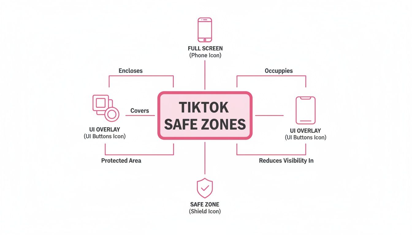
Designing for the TikTok Interface and Safe Zones
Getting the TikTok aspect ratio right is a fantastic first step, but it's only half the battle. Now, you have to think about designing your content to work with the TikTok user interface, not fight against it. Your full 9:16 screen is the canvas, but TikTok is going to place its own elements—like buttons, captions, and usernames—right on top of your masterpiece.
These overlays create "no-go" areas that can completely hide crucial parts of your video. Think about this: one study found that 73% of consumers are more likely to buy something after watching a brand's video. If your "Shop Now" text is buried under the "Like" button, you're throwing away a massive opportunity. Understanding these safe zones is what separates polished, professional content from clumsy, amateurish mistakes.
Decoding the TikTok UI Overlay
When someone watches your video, a bunch of interface elements pop up directly on the screen. These aren't part of your video file; the app itself adds them.
- The Right-Side Rail: This is the vertical strip holding the profile icon, plus the buttons for liking, commenting, saving, and sharing. Anything you put there will be nearly impossible to see.
- The Bottom Section: This is the most crowded spot. It’s where TikTok displays the username, your video caption, the audio track name, and any effects you’ve applied.
- The Very Top and Bottom Edges: These thin slivers of the screen can be faded or blocked by the phone's own status bar (showing the time, battery life, etc.). It's wise to keep these areas clear of important details.
Ignoring these zones is one of the most common rookie mistakes. You could spend hours perfecting a brilliant on-screen text overlay, only for it to be completely hidden by your own username. Not only does this look sloppy, but it makes your message unreadable, giving viewers a perfect reason to swipe away.
Mapping the Safe Zones for Maximum Visibility
So, where exactly is it safe to place your most important content? The "safe zone" is the central part of your 9:16 screen that remains totally clear of TikTok's UI clutter. This is your prime real estate for anything your viewer absolutely has to see.
The core idea is simple: Keep all your essential visual elements—key text, your logo, a product shot, or the main action—squarely in the middle of the frame. This guarantees your message will get through, loud and clear.
Think of it like a movie screen. The main story unfolds in the center, while the outer edges are less critical. On TikTok, those "edges" are just cluttered with buttons and text. You have to frame your shot to protect your most valuable content from all that digital noise.
Practical Example: A Fitness Instructor's Tutorial
Let's imagine a fitness instructor is demonstrating a new exercise.
- Bad Placement: The instructor adds text labels like "Keep Core Tight" near the very bottom of the screen. Once the video is live, their own caption and the audio track name completely block this crucial tip, leaving the viewer confused.
- Good Placement: The instructor places that same text label a bit higher and more towards the center. Now it’s perfectly visible in the safe zone, making the tutorial easy to follow and much more effective.
For anyone who needs to add text to video, mastering safe zone placement is non-negotiable. When you plan where your text and graphics will go ahead of time, you ensure they actually help the viewer instead of getting lost in the UI. This thoughtful approach guarantees your content isn't just seen, but actually understood.
How to Repurpose Any Video for a Perfect TikTok Fit
A smart content strategy isn't about working harder; it's about making your existing content go further. One of the best ways to expand your reach is by taking long-form videos—like podcasts, interviews, or webinars—and slicing them into bite-sized clips for TikTok.
But here’s the catch: you can’t just upload a horizontal video and call it a day. It just won’t work.
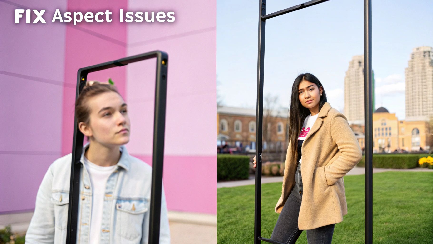
The real challenge is converting a wide 16:9 frame into a tall 9:16 format without losing what makes the content great. This process, called reframing, is absolutely essential. Without it, your video will look awkward and out of place, instantly telling viewers, "This wasn't made for you."
The Headaches of Manual Reframing
For years, the only way to do this was with painstaking manual editing in software like Adobe Premiere Pro or Final Cut Pro. In theory, the workflow is simple: drop a horizontal clip into a vertical timeline and follow the action.
In practice, it’s a nightmare.
Imagine you have a 30-minute podcast interview. Your editor has to constantly adjust the frame’s position, setting keyframes to track the speaker every time they lean in, gesture with their hands, or shift in their seat. It’s a slow, tedious process where a single minute of finished video can take ages to get right.
The biggest drawbacks of doing this by hand are pretty clear:
- It’s incredibly time-consuming: Manually keyframing movement is a slow, detail-oriented task that simply doesn’t scale.
- It’s prone to human error: It's so easy to miss a tiny movement, leading to weird shots where the subject drifts partially out of the frame.
- It gets expensive, fast: All those hours of skilled editing work add up, making it a costly way to produce content consistently.
A Smarter Workflow with Automated Reframing
Thankfully, technology has caught up. AI-powered editing tools have completely changed the game by automating the most mind-numbing parts of the job. Instead of a human editor manually tracking a speaker, an AI can now do it in seconds.
These tools use active speaker detection to figure out who is talking. Once the speaker is identified, the AI automatically reframes the shot to create a new 9:16 vertical video where the speaker is always perfectly centered. This keeps the focus right where it needs to be, resulting in a dynamic, professional-looking clip.
The real win here is the massive jump in speed and consistency. What used to take an editor hours of tedious work can now be done in minutes. You can literally generate dozens of perfectly formatted clips from a single long video.
This is especially important when you remember TikTok’s interface. The on-screen text, buttons, and caption all take up space. Automated reframing is smart enough to keep the action in the central "safe zone," away from all that clutter.
As you can see, keeping the main subject in that protected area is non-negotiable for a good viewing experience.
Repurposing Workflow Manual vs AI Automation
To really see the difference, let's break down the process of converting a single horizontal video clip for TikTok. While manual tools like Premiere Pro are powerful, they require significant time and skill. AI platforms offer a clear edge in speed and scalability.
| Task | Manual Editing (e.g., Premiere Pro) | AI Automation Platform |
|---|---|---|
| Setup | Create new 9:16 project, import footage, create sequence. | Upload the 16:9 video file. |
| Identifying Action | Manually watch the entire clip to find the key subject or speaker. | AI automatically detects speakers or faces. |
| Reframing | Add keyframes frame-by-frame to follow the subject's movement. | AI automatically crops and pans to keep the subject centered. |
| Time Investment | 30-60 minutes per clip, depending on complexity. | 2-5 minutes per clip. |
| Scalability | Very low. Each new clip requires the same intensive manual effort. | Extremely high. Process hundreds of clips in a single workday. |
| Consistency | Varies by editor; prone to human error and missed movements. | Perfectly consistent reframing every single time. |
The table makes it obvious: manual editing just can't compete when it comes to speed and scale. AI automation removes the bottleneck, freeing up creators and teams to focus on strategy instead of tedious post-production tasks.
A Practical Example: The Speaker Panel
Let's make this even more concrete. Say you have a one-hour recording of a two-person panel discussion you originally filmed for YouTube.
- The Manual Way: An editor would have to sit through the entire hour, identifying who is talking and when. They'd need to cut back and forth, crop each speaker's shot, and manually keyframe their movements to keep them centered. Then, they'd have to stitch it all together. This could easily eat up a full day of work for just a handful of clips.
- The AI-Powered Way: You upload the video to an AI platform. The tool automatically identifies who is speaking and creates perfectly framed 9:16 clips for each person's segment. The whole thing is done in a fraction of the time, giving you a folder full of social-ready clips. This efficiency is a massive advantage when you need to repurpose long videos into engaging short clips with AI at scale.
This push toward vertical video isn't just a TikTok thing anymore; it's the industry standard. Instagram Reels and YouTube Shorts have both adopted similar 9:16 formats, creating a clear expectation from audiences that content will be vertically oriented.
Ultimately, you have to nail the tik tok aspect ratio to succeed. To make sure your repurposed content looks sharp, it’s also a good idea to brush up on some video compression tips for YouTube and TikTok to maintain high quality without creating enormous files. By combining smart automation with technical best practices, you can turn your existing content library into a powerful engine for growth.
Common Aspect Ratio Mistakes You Need to Avoid
Even seasoned creators and social media managers stumble into the same old traps when it comes to video formatting. These little mistakes might seem minor, but they can make your content look unprofessional, kill the viewing experience, and tank your performance before the algorithm even gives it a chance.
Getting this stuff right is what separates polished, high-performing content from the rest. Let's walk through the most common mistakes people make with their TikTok aspect ratio and, more importantly, how to fix them.
Mistake 1: Leaving Those Awful Black Bars
This is probably the most obvious and jarring mistake you can make. When you upload a video that isn't shot for a vertical screen—like a horizontal 16:9 clip you pulled from YouTube or a square 1:1 video from an old Instagram post—TikTok has to fill in the gaps. The result? Those hideous black bars at the top and bottom (letterboxing) or on the sides (pillarboxing).
Those bars are a dead giveaway that the video wasn't made for the platform. It instantly shatters the immersive, full-screen vibe that users expect, making your content feel small and out of place. It’s a visual stop sign that tells viewers to just keep scrolling.
The Fix: Simple. Always edit your video in a 9:16 project or sequence from the start. If you’re repurposing old content, don’t just drag and drop it. Take the time to properly crop, reframe, or even stack clips to fill the entire vertical canvas.
Mistake 2: Hiding Key Info Behind the UI
Okay, so you've got a perfectly formatted 9:16 video. You’re not done yet. A huge number of creators forget that TikTok slaps its own interface right on top of their hard work. Your caption, the like button, the share icon—all of it covers up precious screen real estate.
Placing your subtitles, your logo, or a critical call-to-action in these "no-go" zones is a classic rookie move. That brilliant caption you spent time on can get totally lost behind the song title. This doesn’t just look sloppy; it can make your message completely unreadable, especially when you remember that most people watch videos with the sound off.
Let's look at a practical example of a product demo:
- The Mistake: A brand puts their website URL and a "Limited Time Offer!" graphic at the very bottom of the screen. As soon as it's uploaded, their username and the video caption completely block it. Oops.
- The Solution: They shift that crucial info up into the central "safe zone." Now, it's clear as day, and viewers can actually see where to go and what to do.
Mistake 3: Creating Pixelated Videos from Bad Cropping
When you're trying to turn a horizontal video into a vertical one, the quick-and-dirty method is to just "punch in" and digitally zoom on the main subject. Sure, it fills the screen, but it almost always comes at the cost of video quality.
This kind of aggressive cropping is like blowing up a tiny section of a photograph—it gets blurry and pixelated fast. If you started with a standard 1080p video, a heavy crop might knock your effective resolution down to 720p or worse. The final product looks fuzzy and cheap.
How to fix this:
- Shoot Vertically: The absolute best way to avoid this is to just film in 9:16 from the get-go. No cropping needed, maximum quality preserved.
- Use High-Res Sources: If you have to crop, start with the highest quality footage you can get, like 4K. That gives you a ton more pixels to play with, so the cropped vertical slice still looks sharp and clean when exported at 1080p.
- Reframe, Don't Just Crop: Instead of a static, punched-in shot, get creative. Use your editing software to pan across the horizontal frame, following the action. This keeps the subject in view without resorting to a low-quality digital zoom.
Putting Your Money Where It Counts: Aspect Ratios for TikTok Ad Campaigns
When you're running paid ads, getting the technical details right isn't just a suggestion—it's essential. The stakes are much higher than with an organic post. TikTok's ad platform is far less forgiving, and nailing the TikTok aspect ratio is a direct line to a better return on your ad spend.
Think about it this way: ads that don't fit the platform look sloppy and unprofessional. They can get stuck in the approval queue or, even worse, get rejected flat out. But more importantly, ads that do fit perform dramatically better. We're talking a potential 25% higher 6-second watch-through rate for native 9:16 ads compared to repurposed horizontal videos. That's a huge chunk of your audience actually sticking around to hear what you have to say.
Ad Specs That Drive Results
While 9:16 is the golden rule for almost every ad on TikTok, the nitty-gritty details can differ slightly based on the ad type you're running. Knowing these specs upfront will save you headaches and help your campaign get off the ground without a hitch.
- In-Feed Ads: These are your bread-and-butter ads, popping up in the "For You" feed. You absolutely need a 9:16 aspect ratio here. Aim for a crisp 1080×1920 pixels resolution and keep the file under 500 MB.
- TopView Ads: This is prime real estate. As the very first video a user sees, it has to be perfect. TikTok is strict here: only 9:16 will do for that full-screen, immersive experience. The other tech specs are the same as In-Feed Ads.
- Branded Effects: If your campaign involves user-generated content, like a Branded Effect or a Hashtag Challenge, the 9:16 ratio is non-negotiable. It ensures your effect looks great no matter who's using it.
Sticking to these specs isn't just about following rules. A weirdly formatted ad feels jarring to a user scrolling their feed. It screams "I'm an ad!" in the worst way, which boosts skip rates and tanks your campaign's quality score. Ultimately, a poorly formatted ad costs you more money for fewer results.
A Practical Example of Two Ad Campaigns
Let’s see how this plays out in the real world. Imagine an e-commerce brand launching a new sneaker with a splashy TopView ad campaign.
- The Wrong Way: The team is in a rush. They grab the 16:9 horizontal ad they made for YouTube and try to upload it. It gets immediately flagged and rejected for not meeting the 9:16 requirement. The entire launch is now delayed while they scramble to fix it.
- The Right Way: This team plans ahead. They shoot a dedicated vertical video at 1080×1920 pixels. The ad sails through the approval process, takes over the user's entire screen for a stunning first impression, and grabs attention from the first second. The result? A much higher click-through rate and more traffic to their product page.
At the end of the day, treating the TikTok aspect ratio as a core part of your ad strategy is a must. It’s what makes your creative look native, perform better, and stretch every dollar in your budget as far as it can possibly go.
Got Questions About TikTok's Aspect Ratio? Let's Clear Them Up.
We've gone through a lot of the technical details about the TikTok aspect ratio. Now, let's tackle some of the most common questions that pop up when creators start getting serious about their video quality.
What's the Best Aspect Ratio for a TikTok Video, Really?
Hands down, the best aspect ratio is 9:16. No question about it.
This is the native vertical format that fills the entire smartphone screen. It’s what users expect and what the algorithm favors because it creates that seamless, immersive feel. For the sharpest quality, you’ll want to pair that 9:16 ratio with a 1080×1920 pixel resolution.
Can I Just Post My 16:9 Horizontal Video?
Technically, yes, you can upload a 16:9 horizontal video. But should you? Absolutely not.
TikTok will force your wide video into a tall frame by adding chunky black bars to the top and bottom.
This is called "letterboxing," and it instantly makes your video look tiny and out of place. When users are swiping through an endless feed of full-screen content, yours will stick out for all the wrong reasons, which can seriously hurt your engagement.
How Do I Get Rid of Those Awful Black Bars?
Those black bars are a dead giveaway that your video's aspect ratio isn't 9:16. The only real fix is to handle it in editing before you even think about uploading.
- Shooting new stuff? Just hold your phone vertically. Easiest win of the day.
- Repurposing old content? Drop your horizontal or square video into a 9:16 project in your favorite editor. Then, you'll need to crop and reframe the footage to fill the vertical space. Don't let that screen real estate go to waste.
Think of it this way: say you have a great horizontal clip from an interview. Instead of just posting it and getting letterboxed, you'd bring it into an editor, set your project to 9:16, and then punch in on the shot. You could center the speaker, or even cut between speakers, making it feel dynamic and native to the platform.
What Are the Exact Dimensions for a 9:16 TikTok Video?
The magic numbers are 1080 pixels wide by 1920 pixels tall (1080×1920). This is the gold standard for full HD vertical video and guarantees your content looks sharp and professional on any modern phone.
Ready to turn your long-form videos into perfectly formatted, engaging short clips for TikTok? AI can automate the entire reframing and editing process, delivering high-quality, brand-ready content up to 10x faster. Explore how Swiftia can streamline your video workflow today.